·
A lot of mobile developers often complain that React Native is not Native, because it is missing some features. This is absolutely not true! In this blog post I will show you how I create a component with a custom background shape, similar to the one I did for a native component ome time ago
From time to time, while working on your daily job as a mobile developer, the typical discussion about "React Native
vs. Native" (or, generally speaking, " vs. Native") resurfaces,
igniting passions and sparking endless debates about which one is better."
Most of the time, native developers hold the belief that certain more advanced views and effects cannot be created
using React Native.
However, lately, on the web, you can find some great developers (e.g. William Candillon) on a mission to demonstrate that this belief is absolutely not true.
Recently, I had the opportunity to work on a component that could spark this kind of discussion. Essentially, I had
to create a text component with a custom-shaped background and coordinated animations within it, similar to the one
I created here in swift.
Although I may not be as skilled as the developers I mentioned earlier, in this blog post I will demonstrate two
possible ways to achieve the same result of a pure native component for this type of development.
To do this, I will use two different frameworks:
The component that I will create is shown in the following screenshot, and it is composed by:
They will animate in sequence from the top to the bottom in terms of opacity. I will implement it using both the frameworks above, to evaluate their usage complexity.
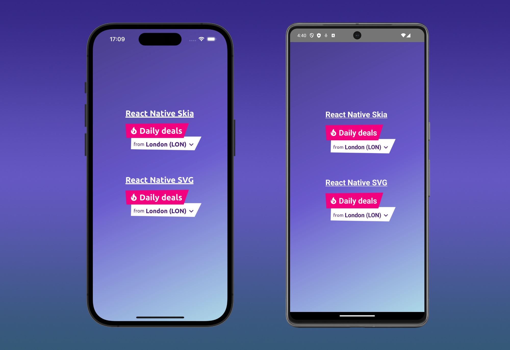
The implementation of the components in the image and video above is composed of two parts:
DailyDealsHeader, that is a component that contains the DailyDealsTitle component
(the title) and the DailyDealsOrigin component (the subtitle).titleShape and originShape props of DailyDealsHeader, and passed
with props drilling to the bottom components where I need to draw it.The DailyDealsHeader component is the main components.
It acts as a container for all the others.
It receives from as props titleShape and originShape, that are the two function used to render the Skia or SVG
backgrounds.
It receives also the originCity and the onPress props, needed by the child to act as expected (show a city name
in the subtitle and react as they are pressed).
type Props = {
  originCity: string;
  onPress: () => void;
  titleShape: (polygonFeatures: PolygonFeatures) => ReactElement;
  originShape: (polygonFeatures: PolygonFeatures) => ReactElement;
};

export const DailyDealsHeader: FC<Props> = ({
   titleShape,
   originShape,
   originCity,
   onPress,
}) => (
   <View style={styles.header}>
     <DailyDealsTitle renderShape={titleShape} />
     <DailyDealsOrigin
             originCity={originCity}
             onPress={onPress}
             renderShape={originShape}
     />
   </View>
);

const styles = StyleSheet.create({
  header: {
    display: 'flex',
    justifyContent: 'center',
    alignItems: 'center',
    flexDirection: 'column',
  },
});
The DailyDealsTitle, as you can imagine, renders the title.
The title is composed by an Image, that has a scale animation created usingreact-native-reanimated, and the
Daily Deals text.
This component uses also DailyDealsBackgroundShape the component in charge of rendering the background
received as renderShape prop.
The features of the background are described by the getPolygonFeatures function.
This function calculate the background shape proportionally to the width and height of the component itself (we
will see later how).
This function will be passed to the DailyDealsBackgroundShape that will compose the renderShape prop with the
PolygonFeatures to draw the background.
import React, {FC, ReactElement, useEffect} from 'react';
import {
  DailyDealsBackgroundShape,
  PolygonFeatures,
} from './DailyDealsBackgroundShape.tsx';
import Animated, {
  useAnimatedStyle,
  useSharedValue,
  withDelay,
  withRepeat,
  withSequence,
  withTiming,
} from 'react-native-reanimated';
import {StyleSheet, Text, View} from 'react-native';

const FIRE_SIZE = 25;
const FIRE = require('/images/fire.png');

const RIGHT_INCLINATION = 15;

const getPolygonFeatures = (width: number, height: number): PolygonFeatures => {
  const widthWithInclination = width + RIGHT_INCLINATION;

  return {
    vertices: {
      topLeft: {x: 0, y: 2},
      topRight: {x: widthWithInclination, y: 0},
      bottomRight: {x: width, y: height},
      bottomLeft: {x: 3, y: height},
    },
    size: {
      width: widthWithInclination,
      height: height,
    },
  };
};

type Props = {
  renderShape: (polygonFeatures: PolygonFeatures) => ReactElement;
};

export const DailyDealsTitle: FC<Props> = ({renderShape}) => {
  const scale = useSharedValue(1);
  const animatedStyle = useAnimatedStyle(() => {
    return {
      transform: [{scale: scale.value}],
    };
  });

  useEffect(() => {
    scale.value = withDelay(
      1800,
      withSequence(withRepeat(withTiming(1.2, {duration: 175}), 8, true)),
    );
  }, [scale]);

  return (
    <DailyDealsBackgroundShape
      renderShape={renderShape}
      opacityDelay={500}
      additionalStyle={styles.shapeStyle}
      getPolygonFeatures={getPolygonFeatures}>
      <View style={styles.dailyDealsTitleContent}>
        <Animated.Image source={FIRE} style={[styles.fire, animatedStyle]} />
        <Text style={styles.titleLabel}>Daily deals</Text>
      </View>
    </DailyDealsBackgroundShape>
  );
};

const textColor = 'white';

const styles = StyleSheet.create({
  shapeStyle: {
    zIndex: 10,
    elevation: 10,
  },
  dailyDealsTitleContent: {
    display: 'flex',
    flexDirection: 'row',
    justifyContent: 'center',
    alignItems: 'center',
    paddingLeft: 8,
    paddingRight: 4,
    paddingTop: 8,
    paddingBottom: 8,
    gap: 4,
  },
  titleLabel: {
    color: textColor,
    fontSize: 24,
    fontWeight: 'bold',
    fontFamily: 'Ubuntu-Bold',
  },
  fire: {
    width: FIRE_SIZE,
    height: FIRE_SIZE,
    marginLeft: 4,
  },
});
The DailyDealsOrigin component is similar to the previous one, event if it is composed by slightly different
pieces because:
onPress received from the top)getPolygonFeatures functionAs I have shown above, also in this case I used the DailyDealsBackgroundShape to compose the renderShape prop with
the getPolygonFeatures function.
import React, {FC, ReactElement} from 'react';
import {
  DailyDealsBackgroundShape,
  PolygonFeatures,
} from './DailyDealsBackgroundShape.tsx';
import {StyleSheet, Text, View} from 'react-native';
import {PressableWithFeedback} from './PressableWithFeedback.tsx';
import Animated from 'react-native-reanimated';

const ARROW_DOWN = require('/images/arrow-icon-bold.png');
const ARROW_SIDE_SIZE = 20;

const BOTTOM_INCLINATION = 3;
const RIGHT_INCLINATION = 20;

const getPolygonFeatures = (width: number, height: number): PolygonFeatures => {
  const widthWithInclination = width + RIGHT_INCLINATION;
  const heightWithInclination = height - BOTTOM_INCLINATION;

  return {
    vertices: {
      topLeft: {x: 1, y: 0},
      topRight: {x: widthWithInclination, y: 0},
      bottomRight: {x: width, y: height},
      bottomLeft: {x: 0, y: heightWithInclination},
    },
    size: {
      width: widthWithInclination,
      height: height,
    },
  };
};

type Props = {
  originCity: string;
  onPress: () => void;
  renderShape: (polygonFeatures: PolygonFeatures) => ReactElement;
};

export const DailyDealsOrigin: FC<Props> = ({originCity, onPress, renderShape}) => (
  <DailyDealsBackgroundShape
    renderShape={renderShape}
    getPolygonFeatures={getPolygonFeatures}
    opacityDelay={800}
    additionalStyle={styles.shapeStyle}>
    <PressableWithFeedback onPress={onPress}>
      <View style={styles.dailyDealsOriginContent}>
        <Text style={styles.fromLabel}>from</Text>
        <View style={styles.originAndArrowIconContainer}>
          <Text style={styles.origin}>{originCity}</Text>
          <Animated.Image source={ARROW_DOWN} style={styles.arrow} />
        </View>
      </View>
    </PressableWithFeedback>
  </DailyDealsBackgroundShape>
);

const textColor = '#441973';

const styles = StyleSheet.create({
  shapeStyle: {
    marginLeft: 16,
    marginTop: -4,
  },
  dailyDealsOriginContent: {
    display: 'flex',
    flexDirection: 'row',
    justifyContent: 'center',
    alignItems: 'center',
    paddingLeft: 8,
    paddingTop: 12,
    paddingBottom: 8,
  },
  fromLabel: {
    color: textColor,
    fontSize: 14,
    fontFamily: 'Ubuntu-Regular',
  },
  originAndArrowIconContainer: {
    flexDirection: 'row',
    alignItems: 'center',
    paddingLeft: 4,
  },
  origin: {
    color: textColor,
    fontSize: 18,
    fontWeight: 'bold',
    fontFamily: 'Ubuntu-Bold',
  },
  arrow: {
    width: ARROW_SIDE_SIZE,
    height: ARROW_SIDE_SIZE,
    marginLeft: 4,
  },
});
Now it's time to see how DailyDealsBackgroundShape is implemented. This component renders its children, wrapped in
an Animated.View on the opacity property.
The most important part of this component is the {renderShape(polygonFeatures)} line of code.
Here I'm composing the rendering function (skia or svg) with the polygon features.
The pattern I used in this application to decouple the type of the shape from this component is called
"render prop".
Do you remember when I said before that getPolygonFeatures is calculating the polygon used as shape
proportionally to the container?
This magic can happen thanks to the implementation of the onContentLayout below.
I get the measures of the DailyDealsBackgroundShape, and I pass them getPolygonFeatures.
This means that getPolygonFeatures will always return a polygon shape coherent with its container
(DailyDealsBackgroundShape).
The PolygonFeatures are composed by:
import React, {FC, ReactElement, useEffect, useState} from 'react';
import Animated, {
  useSharedValue,
  withDelay,
  withTiming,
} from 'react-native-reanimated';
import {
  LayoutChangeEvent,
  StyleProp,
  StyleSheet,
  View,
  ViewStyle,
} from 'react-native';

type Size = {
  readonly width: number;
  readonly height: number;
};

export type Point = {
  readonly x: number;
  readonly y: number;
};

export type PolygonFeatures = {
  vertices: {
    topLeft: Point;
    topRight: Point;
    bottomRight: Point;
    bottomLeft: Point;
  };
  size: Size;
};

type Props = {
  renderShape: (polygonFeatures: PolygonFeatures) => ReactElement;
  opacityDelay: number;
  getPolygonFeatures: (width: number, height: number) => PolygonFeatures;
  additionalStyle?: StyleProp<ViewStyle>;
  children: React.ReactNode;
};

export const DailyDealsBackgroundShape: FC<Props> = ({
  renderShape,
  opacityDelay,
  getPolygonFeatures,
  additionalStyle,
  children,
}) => {
  const shapeOpacity = useSharedValue(0);
  const contentOpacity = useSharedValue(0);
  const [polygonFeatures, setPolygonFeatures] =
    useState<PolygonFeatures | null>(null);

  const onContentLayout = (event: LayoutChangeEvent) => {
    const {width, height} = event.nativeEvent.layout;
    const roundedWidth = Math.round(width);
    const roundedHeight = Math.round(height);

    setPolygonFeatures(getPolygonFeatures(roundedWidth, roundedHeight));
  };

  useEffect(() => {
    shapeOpacity.value = withDelay(
      opacityDelay,
      withTiming(1, {
        duration: 400,
      }),
    );
    contentOpacity.value = withDelay(
      opacityDelay + 350,
      withTiming(1, {
        duration: 400,
      }),
    );
  }, [contentOpacity, polygonFeatures, shapeOpacity, opacityDelay]);

  return (
    <Animated.View
      onLayout={onContentLayout}
      style={[
        {
          ...styles.container,
          opacity: shapeOpacity,
        },
        additionalStyle,
      ]}>
      {polygonFeatures && (
        <View style={styles.polygon}>{renderShape(polygonFeatures)}</View>
      )}
      <Animated.View style={{opacity: contentOpacity}}>
        {children}
      </Animated.View>
    </Animated.View>
  );
};

const styles = StyleSheet.create({
  container: {
    overflow: 'visible',
    alignSelf: 'flex-start',
  },
  polygon: {
    position: 'absolute',
  },
});
Let's see how I "draw" the background shapes. Both implementations are quite straightforward.
The React Native SVG one composes a string of vertices from the PolygonFeatures received.
These are passed to a Polygon component to make it draw the shape.
Its container is a Svg component that set the canvas size using the one received in the PolygonFeatures.
const svgVertex = (point: Point) => `${point.x},${point.y}`;

type Props = {
  polygonFeatures: PolygonFeatures;
  shapeColor: string;
};

export const DailyDealsShapeSvg: FC<Props> = ({
  polygonFeatures,
  shapeColor,
}) => {
  const {
    vertices: {topLeft, topRight, bottomLeft, bottomRight},
    size,
  } = polygonFeatures;

  const topVertices = `${svgVertex(topLeft)} ${svgVertex(topRight)}`;
  const bottomVertices = `${svgVertex(bottomRight)} ${svgVertex(bottomLeft)}`;
  const vertices = `${topVertices} ${bottomVertices}`;

  return (
    polygonFeatures && (
      <Svg height={size.height} width={size.width}>
        <Polygon points={vertices} fill={shapeColor} />
      </Svg>
    )
  );
};
For the Skia implementation, I used the Skia.Path.Make builder.
With this one I created a path from the PolygonFeatures, and I passed it to a Path component.
As for the svg implementation, the container, in this case Canvas, set the drawing size received.
type Props = {
  polygonFeatures: PolygonFeatures;
  shapeColor: Color;
};

export const DailyDealsShapeSkia: FC<Props> = ({
  polygonFeatures,
  shapeColor,
}) => {
  const {
    vertices: {topLeft, topRight, bottomLeft, bottomRight},
    size,
  } = polygonFeatures;

  const path = Skia.Path.Make();
  path.moveTo(topLeft.x, topLeft.y);
  path.lineTo(topRight.x, topRight.y);
  path.lineTo(bottomRight.x, bottomRight.y);
  path.lineTo(bottomLeft.x, bottomLeft.y);
  path.close();

  return (
    polygonFeatures && (
      <Canvas style={{
                width: size.width,
                height: size.height,
              }}>
        <Path path={path} color={shapeColor} />
      </Canvas>
    )
  );
};
As you can see from the implementation above, the more complicated part is outside Skia/SVG. They are simple components focused on the drawing part.
You can find the full implementation of what I described above in this github repo. I had so much fun learning how to use the libraries above. Let's see if in the future I will draw something else with them 🚀.

